Despite a long and prolific career producing a vast array of printed materials for such important clients as Dutch Post, Telephone & Telegraph Service, Forum Magazine and publisher of scientific books Mouton, the name Jurriaan Schrofer is not particularly well known outside a small circle of International typography afficiadios. Hopefully this recently published collection of typographic experiments and constructed letterforms will go some way to raise the status of this sadly neglected but pioneering figure of postwar Dutch design.
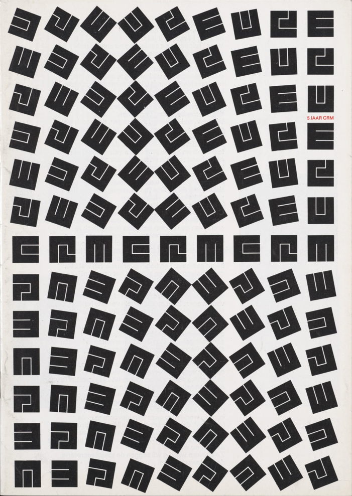
Drawn from a personal archive which spans some forty years, this long overdue monograph forms a stunning collection of experimental letterforms which highlights both Schrofer's typographic invention and his fiercely idealistic approach towards design. Many of his designs are formally breathtaking in both execution and intellectual rigour. Schrofer abhorred dogmatism and this book reveals an obsessive ‘bricoleur’ who endlessly experimented and challenged graphic design orthodoxy. Informed by the graphic possibilities of Op Art, many of Schrofer's typographical experiments uncannily predict the digitally constructed typefaces of today. On the surface, his carefully constructed letterforms have the sheen and visual appearance of digital production yet each one was either painstakingly produced by hand or ‘cut’ in the studio from Mecanorma or Letraset rubdown letters. Schrofer would then take these typographical experiments and layer them in complex arrangements using techniques commonly associated with darkroom photography. In this laboratory of letterforms, mathematical precision was tempered by a joyous use of colour and playful inventiveness. Letterforms would become stretched to the edge of legibility, pattern and meaning became fluid and interchangeable. Words were stretched, rotated or looped into endlessly inventive forms of communication creating a new and utterly mesmeric typographic language. Wonderful stuff indeed.
This book reveals a veritable treasure trove of graphic wonder and hopefully it will help introduce Jurriaan Schrofer's work to a much wider and more appreciative audience. Highly recommended.
This book reveals a veritable treasure trove of graphic wonder and hopefully it will help introduce Jurriaan Schrofer's work to a much wider and more appreciative audience. Highly recommended.
"Jurriaan Schrofer - Restless Typographer is published by Unit Editions.