Showing posts with label graphic design. Show all posts

Saturday, May 18, 2013

Enjoy The Experience

Welcome to a world of neglected musical misfits and bargain bin freaks; the LSD soaked lounge crooner, the astral trippin’ cowboy, the electronic porno balladeer, the psychedelic disco queen, the yodelling yoga teacher and the queer cult leader ......

For the last couple of weeks I've been leafing through an oddly enjoyable book called “Enjoy The Experience” by Johan Kugelberg. It's probably the most definitive handbook of 'odd' I've read. The book collects the lost fragments and faded dreams of a thousand or so obscure musicians who, despite having no record deal, released their own unique and occasionally brilliant recordings on an unsuspecting and largely indifferent world. It’s a fascinating story, populated by ordinary people with strange dreams and like the most interesting outsider art, the very best of these private press records have a raw immediacy and visionary power seldom heard (or seen for that matter) in the mainstream. If you're looking for a bumper book of weird and ‘out there’ graphic strangeness, this is the book for you. Unmediated by graphic design convention or artifice, many of the record covers function as highly illogical, off-kilter archetypes or pictorial missives of zoned-out eccentricity which perfectly mirror the highly personal and curious music contained within their respective custom made grooves. A plethora of weird gear idiosyncrasies elevate several of the designs beyond the mundane and into the sublime creating a ‘higher key’ vernacular graphic art of blurred amateur photography, awkward layouts, visionary typography and peaked ‘stare at the sun’ high school illustration.

Weird gear all round.

If you’re a seeker of eccentric vibrations from the late 1960s and 1970s this book is pretty much essential. Seek out.

“Enjoy the Experience” by Johan Kugelberg is published by Sinecure Books.


Thursday, May 09, 2013

Iran:RPM Soundtrack Design From A Pre-revolutionary Iran

Here's a selection of images from a wonderful book I picked up recently which documents the design of Iranian soundtracks records prior to the 1979 revolution entitled Iran:RPM. What's particularly striking about the book, is that it reveals an emerging popular culture in which traditional and modern values have collided into vibrant and unique forms of expression. Many of these 'graphical' hybrids succinctly illustrate the sheer unexpected range of conflicting cultural ideologies which were present within pre-revolutionary Iran; with lurid sexploitation, cop show theatrics, feminist politics, existential protest song and Persian epics sitting uneasily together to form a most curious and rewarding trip into the hidden cultural history of a pre-revolutionary Iran.

Iran:RPM is published by Magic of Persia with the sponsorship of Salsali Private Museum and Avantgardeglobal.


Monday, April 15, 2013

Ryszard Kiwerski

Has a monograph ever been published on the work of Polish graphic designer Ryszard Kiwerski? These photomontages are simply stunning. If you knows of one please get in touch!


Monday, March 11, 2013

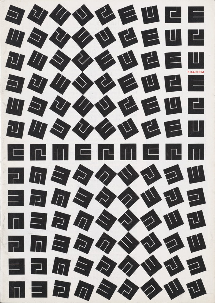
Jurriaan Schrofer [1926–90] : Restless Typographer

Despite a long and prolific career producing a vast array of printed materials for such important clients as Dutch Post, Telephone & Telegraph Service, Forum Magazine and publisher of scientific books Mouton, the name Jurriaan Schrofer is not particularly well known outside a small circle of International typography afficiadios. Hopefully this recently published collection of typographic experiments and constructed letterforms will go some way to raise the status of this sadly neglected but pioneering figure of postwar Dutch design.

Drawn from a personal archive which spans some forty years, this long overdue monograph forms a stunning collection of experimental letterforms which highlights both Schrofer's typographic invention and his fiercely idealistic approach towards design. Many of his designs are formally breathtaking in both execution and intellectual rigour. Schrofer abhorred dogmatism and this book reveals an obsessive ‘bricoleur’ who endlessly experimented and challenged graphic design orthodoxy. Informed by the graphic possibilities of Op Art, many of Schrofer's typographical experiments uncannily predict the digitally constructed typefaces of today. On the surface, his carefully constructed letterforms have the sheen and visual appearance of digital production yet each one was either painstakingly produced by hand or ‘cut’ in the studio from Mecanorma or Letraset rubdown letters. Schrofer would then take these typographical experiments and layer them in complex arrangements using techniques commonly associated with darkroom photography. In this laboratory of letterforms, mathematical precision was tempered by a joyous use of colour and playful inventiveness. Letterforms would become stretched to the edge of legibility, pattern and meaning became fluid and interchangeable. Words were stretched, rotated or looped into endlessly inventive forms of communication creating a new and utterly mesmeric typographic language. Wonderful stuff indeed.

This book reveals a veritable treasure trove of graphic wonder and hopefully it will help introduce Jurriaan Schrofer's work to a much wider and more appreciative audience. Highly recommended.

"Jurriaan Schrofer - Restless Typographer is published by Unit Editions.


Tuesday, February 05, 2013

Sunday, December 09, 2012

Structure and Substance

"A style shouldn’t impose, it should always, as it were, arrive, be taken in, absorbed. If we look at any movement, religious, cultural, national or supra-national, and that movement is dedicated towards some kind of homogeneity – like, say the Nazis, who had the most effective corporate identity there has ever been – this should warn us."

For the past week or so I've been delving into the the remarkable and thought provoking world of British designer Ken Garland via a recently published monograph by Unit Editions. Ken Garland is without a doubt one of Britain's most influential post war graphic designers, a fervent educator, theoretician and political activist whose uniquely playful brand of modernism and intellectual rigor has for the last six decades consistently challenged and expanded the philosophical landscape of British graphic design. Balancing the graphic refinement of objective Swiss formalism with an emotive energy and sometimes eccentric vision, his work exemplifies the importance of human relationships and ethical forms of communication within the field of design. It's a fascinating survey of work which clearly demonstrates the manner in which many of his once unpopular ideas regarding social engagement and political responsibility within the design profession are in fact more relevant today than when they were first espoused. An essential book for non-practitioners and practitioners alike. 

“Ken Garland - Structure and Substance” is published this month by Unit Editions.